A New Beginning…
At Richcroft, we’ve always had a ‘we welcome’ all philosophy for the individuals we support. We have always strived to ensure that the individuals we support with varying intellectual and developmental disabilities are respected and that their abilities are the focus. This is why we decided to revamp our current website, brand messaging, and logo in order to best reflect our care model and the core values we hold dear.
During the logo kickoff meeting with Redstart Creative’s Creative Director, Elisa Watson, we were able to explain that despite our previous logo’s shortcomings, it still had some history behind it that many people would associate with our brand and our culture of caring. We talked about what Richcroft stood for and what we wanted to encompass as part of our re-design and the phrases that stood out to her included “opening of doors”, “serving the people”, and “seeing the abilities of the people we support”. As part of the creative process, Elisa decided to capture what she could out of those phrases toward conjuring several logo prototypes that we could see and decide upon. This process, despite being new to us at Richcroft, was thorough and thought out. We were able to appreciate the effort and nuance it takes behind designing a symbol that can hopefully become recognizable for our organization.
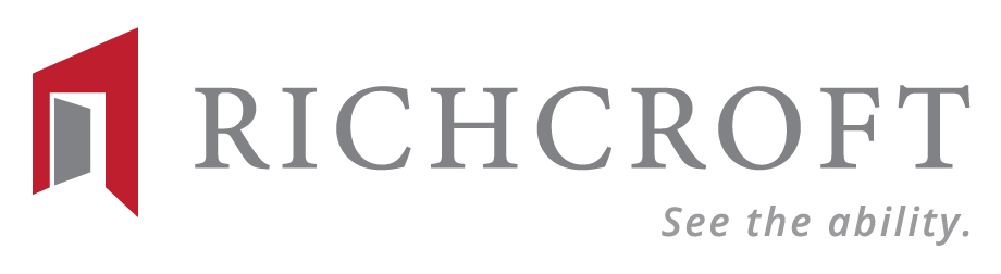
During the subsequent meetings and back and forths, various designs were presented to us and although many resonated with our staff members, there was one concept that Elisa displayed that really stood out, especially to Kevin Drumheller, our CEO. The opening of doors with a slightly pointed tip, symbolizing an arrow. Elisa explained her thought process behind the design: that she fell in love with our ‘empowering the people’ value and wanted a design that not only ‘literally’ reflected our mission of having an inclusive culture, but also ‘figuratively’ since we also open doors for our individuals to find jobs, cultivate friendships and build relationships. The ‘arrow’ gesture, she also explained, was a way to convey the idea of our organization moving upwards and forwards; a classic sign of progression, expansion, and growth- all qualities that Richcroft is very eager to communicate.
The color palette we all settled on was also symbolic. The reds, whites, and grays have become so integral to Richcroft’s brand that it was hard to move away completely. Elisa respected this and proposed that she simply expand the color palette, therefore, holding on to our little piece of history while enabling our supporters to understand fully where we were headed. These little details are all nods to our previous branding that has served us sufficiently all these years.

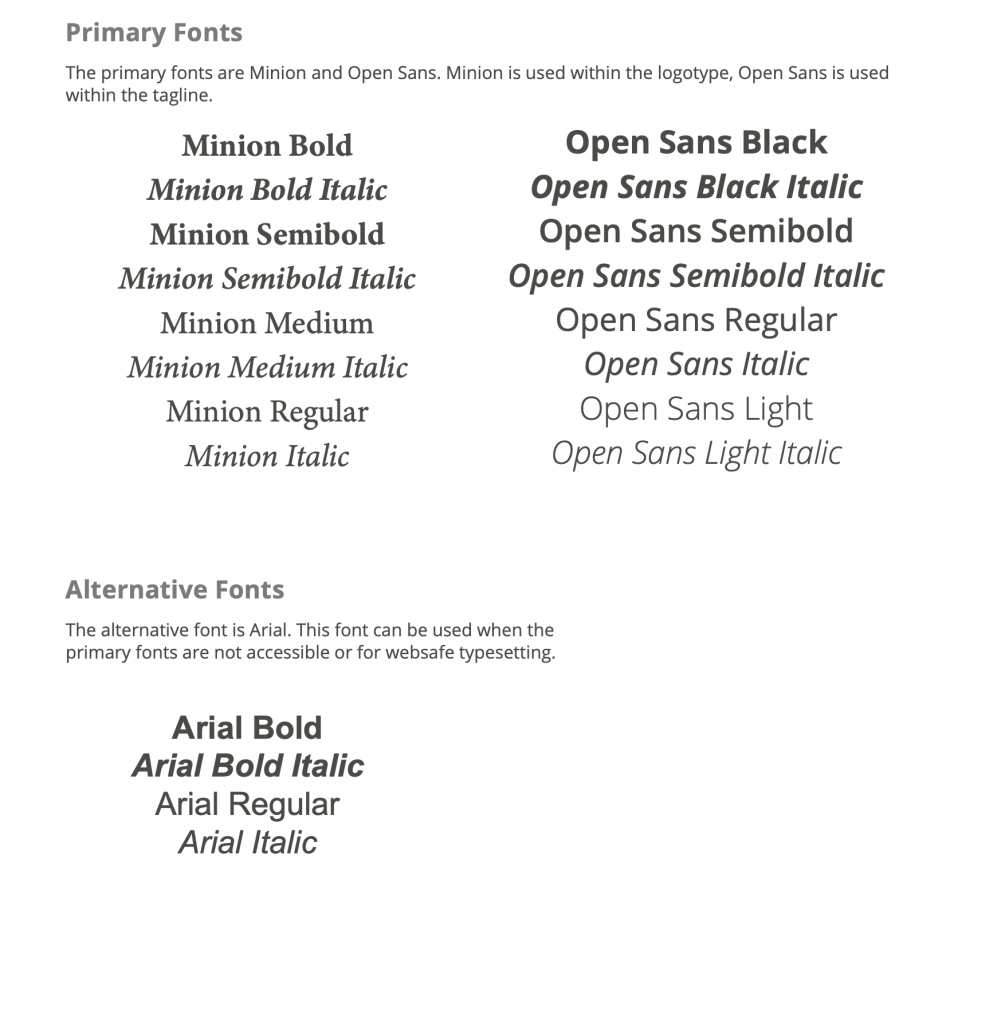
Elisa also delved deeper into the creative process by suggesting various fonts that she felt would also resonate with our stakeholders and the people we support. This worked in tandem with our brand re-visioning as we also wanted a new tagline, which became “ See the ability “. Having seen the method in which our logo was constructed, we had full faith that Elisa would come up with suitable ideas, in terms of typography, and gave her full creative reign to decide for herself what she thought would be best. We were not disappointed. The choices she came up with were Minion for the main Richcroft wording and Open Sans in italics for the tagline. The reasoning behind her decision was thoughtful and detailed: She chose Minion as a font for Richcroft because it was strong, contemporary, and could stand alone. The font for the tagline is softer and gives the idea of hope and cheerfulness, therefore embodying the welcoming feel that Richcroft strives to give the people we assist. Both of these choices were worlds different from our old fonts used and, once we saw how well they worked together, we were impressed with the cohesiveness of the image and the tagline.
The final design and logo tied in perfectly with the redesign of the website and the branding that goes along with it. Redstart Creative also provided us with our new branding guidelines, enabling our staff to use the logo and tagline appropriately with all future correspondence and communication.
At Richcroft we feel confident that our referral sources, staff, donors, and other funding sources will be impressed by the overall new look and feel of the website and the new logo. We also have full faith that, despite not being a recognizable brand before, this will certainly improve, and those who have supported us since the very beginning will equally feel comfortable with the new aesthetic because it still feels welcoming and familiar. It’ll feel like coming home.